Sunday, 22 June 2014

Frames 4

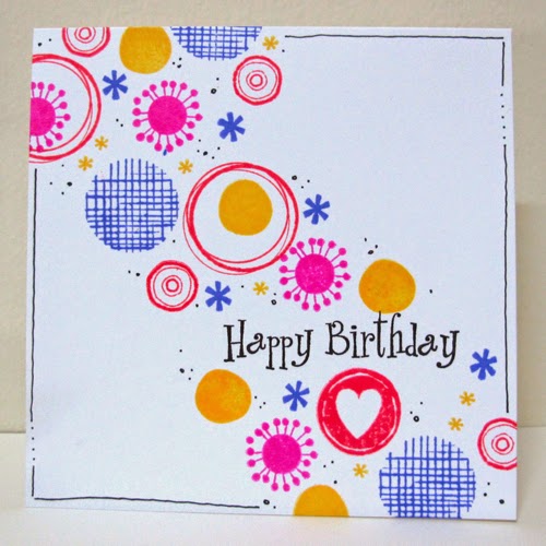
Last card for the "I've been framed" challenge at One-Layer Simplicity! I'm sure you're tired of them now!

It is the same grid layout that I used for the Frame 3 card, but I wanted a completely different look. Used watercolour to paint behind the frames. Once it was all dry, I added a splatter of red. I will also enter it for the Watercolour Challenge at Less is More.


A bright red enamel dot to pop the sentiment.


Saturday, 21 June 2014

Frames 3 (Categorizing & stamp storage)

I cannot believe how many frame stamps I actually have. So I decided to make a grid of 9 of them. I mounted them on a block which I had placed over a grid so that I could get the spacing right (thanks for the tip from Bronwyn who was stamping with me!). Wonderful as it meant I could stamp up a bunch of cards with the same layout ... or even rotating the layout as it was a perfect square.


I wanted a crisp masculine card and so used Colorbox Cranberry, Hero Arts Charcoal & Hero Arts Soft Granite in addition to the black. I added a metallic brad to the sentiment to make it pop more. Still for the "I've been Framed" challenge at One-Layer Simplicity.


If you want to know why I have so many frames, I had bought the whole alphabetic series of stamps (full A-Z set) from Hero Arts of Sparkle Clear letters. Here are a few of them ...


But I hardly ever used them (except for a couple of flowers, a sun stamp and some birds). Bronwyn was rearranging and storing her stamps by category, so I decided to break up the packs and put all the matching alphabets together, flowers together, frames together, etc.  - using the Avery Elle plastic packets. I cut each image on the acetate, and arranged them on a new piece of acetate, and then stuck them down with transparent packing tape. A BIG job I can tell you - but really worth it in the end. It completely changes your perspective. 

Much easier to "see" :
4 alphabet sets (5 if you count the one with lower case too), 
26 frames (needed 2 packs to store them), 
26 flowers and 
a wonderful collection of birds, butterflies and little filler stamps.


I think I will use them a lot more frequently now.  What do you think?

[ I'm in the process of doing ALL my stamps and it is a mammoth task. Will post once I've finished them all. One day I did 75 packets, and not even halfway there! Scary to see my supply of stamps. ]

Friday, 20 June 2014

Frames 2

For this card, I pretty much case'd the inspiration card at One Layer Simplicity, adding colour and candles. Frames are from Hero Arts, candles and sentiment from Papertrey Ink.


I also put glossy accents around the frame with the sentiment to make it pop more.


Thursday, 19 June 2014

Congrats!

With graduations coming up, I'm making some to have ready to go. This is a masculine one, based on the Seize the Sketch Challenge and inspired by Laurie's Card. I embossed some silver paper and added a May Arts ribbon. The stamps are from Club Scrap.


Here is the sketch, which I flipped on it's side


Frames 1

The "I've been Framed" Challenge at One Layer Simplicity has had my creative mojo on a roll ... so as you can see by the blog post title, you can expect more to come.

This first card is a simpler version of the inspiration card. Instead of putting frames over the whole card, I just made a line of them. (All Hero Arts stamps) I coloured the cupcakes with Prisma crayons and added a gem on top.


Monday, 16 June 2014

First Gelli Plate Print

Played with the Gelli Plate for the first time this morning. Not a clue what I was really doing - adding layers and stencils and textures from a vague memory of a video. 

This was my first attempt ... made into a card. I used the Hero Arts stencil Large Lotus Pattern, with some bubble wrap and the Hero Arts Tiny Ink Spots stamp adding more texture. Added a sentiment and butterfly with some wink of stella and voila!


Tried another one, and things got worse (paint was not coming off onto the paper), but luckily I found and re-watched that wonderfully fun video by Barbara Gray, and found out how to do it. So you'll be seeing lots more of these. I just love the rich vibrant look.

Sunday, 15 June 2014

Over the Edge

I needed a card for my sister-in-law's 60th. I haven't used this stamp set (Papertrey Ink Embroidered Blooms) for a while. Added glossy accents on the centers.


I will enter this for the Over the edge, one layer challenge at Less is More.

Saturday, 14 June 2014

Card Scramble

Linda is hosting this card scramble over on the Hero Arts Flickr Group. Her theme is dots. I wasn't going to play as it's quite late, but I can't resist dots!

Started with a more arty one ... paint splatters, and spritzing my stamps.


Then decided to use some of my large Hero Arts dots stash of stamps in a more crisp CAS design.


After seeing it on screen, thought it needed more balance.


Which do you think is better?

And thanks to Ardyth for giving me the heads up, I'll be entering the last one in the Simplicity One Layer "Frame" challenge. It also meets the criteria at the Less is More Over the edge one layer challenge.


Friday, 13 June 2014

May CCC

My card for the May CCC 


based on the colours, sketch and theme of Friends.


You still have a couple of days if you want to join in for the June CCC. And if you get in quick I will be the lucky recipient of your card!


Favorite Flowers Block

I have been making Thank You gifts for teachers trying to use up as much of my paper stash as possible, so I wasn't planning to stamp. But when I made this block, I decided it  would look so much better if the sides weren't white.


So out came my newest stamp set (SSS Favorite Flowers from the June 2014 kit). I started with the biggest flowers first, then the smaller and lastly the leaves. Then I sponged yellow in the gaps.


Thursday, 12 June 2014

CASE-ing Jen

I'm CASEing Jen's card as I loved the mix of grunge yet quite light feel.


When I see a card I like, I see what I have in my stash that can replicate it, or give me the same feel.  I wanted that charcoal grey paper, but didn't have anything. So I inked directly from pad to paper using Hero Arts Soft Granite, and then stamped the Tweed Background stamp with Hero Arts Charcoal. Love it.


Inspired by ... Suze

Suze was show cased on the Texture Challenge at Addicted to CAS.


When I see a card I like it might be days until I might CASE it, and I do from memory which is not as good as it used to be!  I didn't have a large heart die, so I used a star. I knew there was a "baby" message, but I thought it was on a banner. However, there was no space for a banner as it would block one of the points. 


I might use this for my daughter's graduation.


Wednesday, 11 June 2014

Inspired by ... the colours of my bedroom

Less is More is having a Colour Challenge using the colours in your bedroom.

The blanket I started crocheting last year is finished in time for this winter ... and it's on the bed! I used 5 different wools, and 3 different Tunisian crochet stitches.

And a close up of the stitches ...


So here's my card! I used some of my new sets of SSS stamps from their pure sunshine release.


And I had wool left over, so I started this "baby blanket" which looks like it will become a throw as the wool seems to go last. So so happy with this pattern.


Related Posts with Thumbnails