Showing posts with label Perfect Pearls. Show all posts

Tuesday, 16 July 2019

Shimmery Wishes

We have a lovely challenge at CASology with the cue word of SHIMMER. It is a 3 week "summer" challenge which gives you plenty time to join in.


I started with embossing the grid stamp with Enchanted Gold embossing powder. It has such a lovely shimmer.

I stamped the shell, coloured with Copics, used a Versamark pen to cover it all, then painted with Perfect Pearls.  Gives it a lovely nacre look.


Here you can see the nacre look close up.


Come and check on the creations of the design team and be inspired. Looking forward to seeing your take on the cue word.


Guest Designer : Maria

Sponsor : Stamplorations


Saturday, 15 June 2019

Birthday

Altenew was very clever with this washi tape ... it coordinates with the Floral shadows stamp and die cut sets!


I did brush the stencilled background with Perfect Pearls, but so difficult to capture on camera.


My entry to ...

Thursday, 11 October 2018

Autumn Leaves

I'm trying to use up my my bits and pieces that seem to multiply faster than completed cards! I was tidying up and sorting by colours which I hoped would help me use them.

So the leaves, strip and fibres were in all my stash.


Thursday, 21 June 2018

See the Flowers

I've had a bad ink day! Stamping a second time with the MISTI to get a stronger black outline, and STILL getting a double image; splashing ink where it should not go, having a completed card fall on my cleaning sponge .... and on it went.

But this card survived it all!

Distressing with Distress Oxides is pure pleasure! AND you can paint with it over previous colours without the base colours coming through.


I added Diamond Stickles to the zig zag lines, and Hero Arts Lacquer to the centre.


Tuesday, 12 June 2018

Pearl

It's a wonderful challenge at CASology this week. The cue word is PEARL. There are so many possibilities for this challenge. 

I decided to used Distress Inks and then spritz with Perfect Pearls to give the paper that nacre look. I used the negative cut of the SSS Circle leaves die first, glueing in the pieces using the positive shape to guide me. And then I added my sentiment and some Liquid Pearl dots.


A shot to capture the Perfect Pearls.


Of course I still had the positive cut. I went a lightly busier look, adding little dragonflies.


Here you can see the how I popped the panel on foam dots for dimension.


And the lovely blue Perfect Pearls.


Which one do you prefer?

Pop on over to the design team to get more inspiration ... and then I'm looking forward to seeing your take on Pearl !


Saturday, 13 May 2017

Dark Cards

When I saw Debbie's card, I knew I wanted to try something similar. She used Finetec Iridescent Watercolours, but I have so many supplies that I am NOT buying more stuff right now. So my first idea was to mix some Perfect Pearls into some Distress Oxide inks and paint with that. The pearl look did not come through as with regular Distress Inks, so I waited until it was dry. Then I painted on dry Perfect Pearls and then gave a spritz of water. That gave a lovely shimmer.


I stamped the same panel of flowers as they were already set up in the MISTI, but I embossed in silver this time. I coloured this one with Prismacolor crayons.


Sunday, 28 August 2016

Blending Take 2

I'm back to using the faux metallic technique that I saw on Jennifer McGuire's blog. But this time tried to go for the feminine touch and soft colours, a very light embossing folder and butterflies. You can see the shimmer from the Perfect Pearls.


Thursday, 25 August 2016

Heavenly Colours

Sunrises, sunsets, and pretty skies are just a delight to me. I feel as though I've been given a special painting as a gift for the day. 

So I was happy to see Marilyn's inspiration at the Muse Challenge this week.  I was inspired by her :
  • silhouette in both white and black; 
  • white embossed sentiment and 
  • blended background 
This is my special "rainbow" sky, using Mustard Seed, Salty Ocean, Picked Raspberry and Dusty Concord. I added Perfect Pearls white on top to give a lovely shimmer. I was inspired by the colours on the AAA Cards : Blended Challenge.

Entering the Addicted to CAS : Silhouette Challenge too.


I thought the Dusty Concord a bit too dark, so the next one was made (by Christine) with Shaded Lilac instead.


Monday, 22 February 2016

Flowers and Butterflies

Linda had a lovely Card Scramble last night, which tied in with the Hero Arts Fabulous Flower Challenge, but added the extra challenge of adding an insect.

This is the card that I got finished in time for the 90 minute deadline, inspired by Jennifer McGuire's Distress Ink lifting technique.


Then I tried to make a second, but didn't complete it in time. So I finished it today, and will enter it to the Hero Arts Fabulous Flower Challenge.


And angled to try to catch the glimmer from the Perfect Pearls.


Monday, 8 February 2016

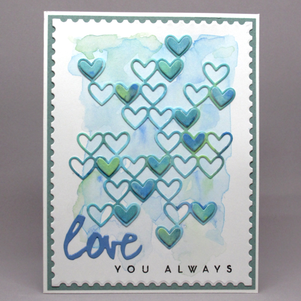
Shimmery Hearts

I'm still trying to focus on more masculine cards, and I think this is the one I will give my husband.

I added Perfect Pearls to Distress Inks so it has a lovely shimmer. To make the match, II picked a metallic blue paper to use for the die-cutting.

Here is the straight-on photo, but you don't get an idea of the shimmer.


 So I angled the card, so I could catch the shimmer  ...


And a close-up.


I'll be entering this to ...


Friday, 29 January 2016

It's your day

Playing with Jennifer's faux metal technique for the Less is More : Silhouette Challenge.

I used Tumbled Glass and Blueprint Sketch with Perfect Pearls. I wanted to matt it on the same colour blue, but couldn't find a match ... so I repeated the technique on the borders of the card base. Voila!


Wednesday, 30 September 2015

Shimmery Butterflies 2 ...

Using more of Bronwyn's butterflies .... 2 of the smaller ones.


Here's a close-up of the shimmer 


Shimmery Butterflies 1 ...

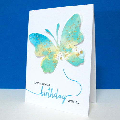
My friend Bronwyn came stamping today with a whole stash of wonderful butterflies. She had inked up a craft sheet with Distress Inks, spritzed with Perfect Pearls and smooshed the paper into the ink. When it was dry, she die cut the butterflies. Then she flicked some Delicata Gold refill ink over. It gives such a lovely shimmer.

Of course, I chose of the blue/green ones! Paired it with a Papertrey Ink Smoosh sentiment.


Here's the warm orange option.


Entering it to the Less is More : Something Shiny Challenge.


Monday, 3 August 2015

Strip Down #2


Having started playing with Jennifer's Faux Textured Metal technique, I had to try one actually adding the textured part.

I went with straight lines this time so that it will definitely qualify for the One-Layer Simplicity Strip Down Challenge.

Using my new Echo Park embossing folder, I went for a more graphic, masculine card which goes well with the faux metallic look.


Tuesday, 21 April 2015

Birthday Balloon

I seem to be getting the hang of these die cuts now ... another one that has been in my stash for a couple of months that I'm finally getting to use.


After distressing my balloon in blues to create the ombre effect, I gave a good spritz of Perfect Pearls to give a lovely shimmer like a metallic balloon.


Wednesday, 25 February 2015

Playful Colours

So taken by the Colour Me : Playful Challenge this week!


What gorgeous swirls of colour! Love how it inspired me to use an older stamp in a new way. Painted with Distress Inks and then spritzed with Perfect Pearls. The sentiment is from Annabelle Stamps.


And a close-up to see the shimmer from the spritz of Perfect Pearls.


I will also enter this into ...


Related Posts with Thumbnails