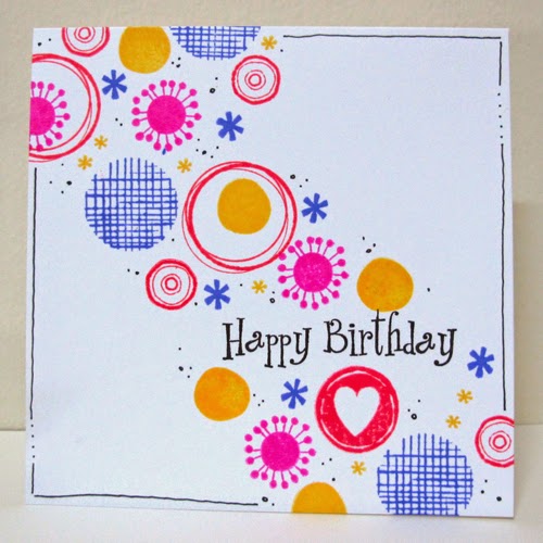
Linda is hosting this card scramble over on the Hero Arts Flickr Group. Her theme is dots. I wasn't going to play as it's quite late, but I can't resist dots!
Started with a more arty one ... paint splatters, and spritzing my stamps.
Then decided to use some of my large Hero Arts dots stash of stamps in a more crisp CAS design.
After seeing it on screen, thought it needed more balance.
Which do you think is better?
And thanks to Ardyth for giving me the heads up, I'll be entering the last one in the Simplicity One Layer "Frame" challenge. It also meets the criteria at the Less is More Over the edge one layer challenge.


Oh I am glad you did play along. These are both fabulous. So cheerful.
ReplyDeleteThat third one (my fave) is good for One Layer Simplicity, love the bright colours and you're right, the frame makes it feel finished!
ReplyDeleteLove the OLC .. framed one is my favourite
ReplyDeleteThanks for joining us this week
Jen xx
Less Is More
Both gorgeous, but i love the first one a bit more
ReplyDeleteFabulous bright & cheery cards Janet
ReplyDeleteMargaret x
The last one is the best.
ReplyDeleteLoving them all, my fave is the last one too - it's the hand drawn border
ReplyDeleteKathyk
Super cards and the frame really works well on your OLC, gives it a lot more impact!
ReplyDeleteThanks so much for joining us again this week at Less is More
Anne
LIM Designer
Hi Janet, Beautiful cards! I prefer the last one as well, with the drawn border. That really finishes the card off nicely! xo Tone
ReplyDeleteLove all of them.
ReplyDeleteLynne xxx
Wowzers Janet ... 2 stunningly beautiful cards and I'm particularly attracted to all the delicious vibrant colours on the LIM one. Perfect stamping.
ReplyDeleteThanks so much for sharing and taking part.
Sarah xx
Less is More
Their such HAPPY cards!
ReplyDeleteThese are great cards, in fact I like the LIM one without the frame...must be my simple mind!
ReplyDeleteThanks so much
Chrissie
"Less is More"
Fabulous cards, love the designs and the colours ..... I'm with Chrissie on this one the LIM without the frame is my favourite!
ReplyDeleteLinda xx
LIM Guest Designer
such a fun and cute card....thanks for playing along with the OLS.
ReplyDelete